Page 1 of 2
Cartoon background
Posted: Sun Jul 11, 2010 3:43 pm
by PARKER
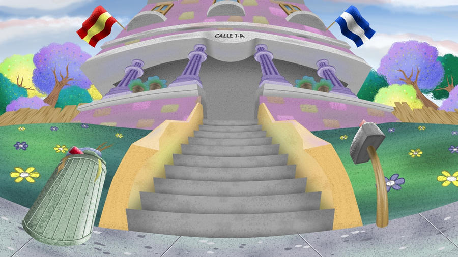
Any kind of comments are welcome, enjoy:
Posted: Sun Jul 11, 2010 3:54 pm
by sbtamu
Nice use of "fish eye lens" that's the only term I can come up with atm.
I like the colors also.
May I ask what inspired you to use this type of camera view?
Posted: Sun Jul 11, 2010 4:13 pm
by PARKER
sbtamu wrote:Nice use of "fish eye lens" that's the only term I can come up with atm.
I like the colors also.
May I ask what inspired you to use this type of camera view?
I just wanted to do something different, most of my backgrounds are too flat.
Im looking for making the most interesting perspective possible.
Posted: Sun Jul 11, 2010 4:39 pm
by Víctor Paredes
Very nice! I love your new search, Parker, it's very inspiring.
Posted: Sun Jul 11, 2010 5:45 pm
by PARKER
selgin wrote:Very nice! I love your new search, Parker, it's very inspiring.
Thank you very much for your kind words.
Posted: Sun Jul 11, 2010 6:05 pm
by elbramtsol
I love it!!
Just one little comment, I think that the trashcan would look better if the lines where not straight, just like the mailbox does.
Posted: Mon Jul 12, 2010 2:33 am
by ulrik
Love it Parker!! Well done!

Posted: Mon Jul 12, 2010 3:16 am
by Paul Mesken
This is great Parker. You can put drawings like this in your portfolio. The whole composition gives the building character (there are some very minor perspective issues but such things are seconday, you pulled of the character and that is the most important part).
The post box looks like a guard of the building, with a pushed out chest. The garbage bin is the only thing that's a tad on the weak side. Its line doesn't lead up to the center of interest. It just stands there (perhaps you could make a "guard" out of it as well).
Your DeviantArt drawings show a great progress. Perhaps you should try a couple of different color combinations now (you really love that purple/green combination). Or work with color accents (like using a strong orange in some small places of interest while everything else is tints of subdued greenish blue). Or have some backgrounds completely done with shadows and light.
Posted: Mon Jul 12, 2010 4:39 am
by AmigaMan
That's a beautiful background. What version of AS are you using for these? I assume you used AS for this too?
Posted: Mon Jul 12, 2010 6:17 am
by PARKER
AmigaMan wrote:That's a beautiful background. What version of AS are you using for these? I assume you used AS for this too?
Yes i always use AS for these backgrounds, i used version 6.2.
Posted: Mon Jul 12, 2010 6:24 am
by PARKER
Thank you all for your comments, thanks elbramtsol and Paul for your reviews.
I hope you keep reviewing the next works i will be posting.
I actually prefer criticism than praises

Posted: Mon Jul 12, 2010 1:33 pm
by J. Baker
PARKER wrote:...I actually prefer criticism than praises
Sorry, no criticism here. That is an awesome background! Your art skills have definitely improved since I first noticed you on this forum. Not that they were bad before. Congrats!

Posted: Mon Jul 12, 2010 1:34 pm
by PARKER
J. Baker wrote:PARKER wrote:...I actually prefer criticism than praises
Sorry, no criticism here. That is an awesome background! Your art skills have definitely improved since I first noticed you on this forum. Not that they were bad before. Congrats!
Yes i have improved myself a lot, thanks J. baker.
Posted: Mon Jul 12, 2010 5:14 pm
by J. Baker
Did you use the scatter brush for this? If so, how long did it take to render it?
Posted: Mon Jul 12, 2010 10:00 pm
by PARKER
J. Baker wrote:Did you use the scatter brush for this? If so, how long did it take to render it?
Do you mean to make the textures? i used normal brushes, png images.