Define my color universe?
Posted: Sun Mar 11, 2007 2:18 pm
Philosophical question here...
I keep turning it over in my mind but I can't get clear...
To begin with, there isn't any question that an artist must exert discipline over his colors, for various reasons:
- you want to maintain a pleasing color harmony
- you want to draw just so much relative attention and no more to the focus of interest, using color
- you want to maintain a fundamental visual continuity throughout a production
- you generally want to convince the audience they're looking at a valid representation of reality (grass normally shouldn't be blue, seagulls normally shouldn't be green).
- you want to use color in an expressionist way, so that various colors symbolically impart certain emotions
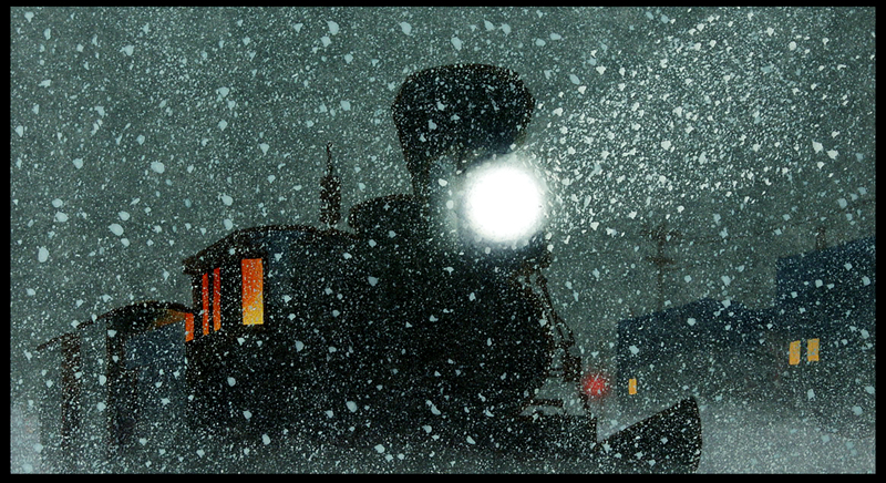
Given that, what I'm trying to understand is the impact of collapsing your color universe down to a tiny palette, for instance a monochromatic palette of oranges, browns, and grays.
Or what if you had a movie that only used two monochromatic palettes, orange tones and blue tones?
Can you draw the audience deeper into your world by making such a strong stylistic statement, or do you distance the audience by divorcing too much from reality?
Of course, I understand this is a non-issue if you're doing raw cutout anime ala "South Park," or a lampoon such as "The Simpsons," but what if your intention as a story teller is to be serious?
I keep turning it over in my mind but I can't get clear...
To begin with, there isn't any question that an artist must exert discipline over his colors, for various reasons:
- you want to maintain a pleasing color harmony
- you want to draw just so much relative attention and no more to the focus of interest, using color
- you want to maintain a fundamental visual continuity throughout a production
- you generally want to convince the audience they're looking at a valid representation of reality (grass normally shouldn't be blue, seagulls normally shouldn't be green).
- you want to use color in an expressionist way, so that various colors symbolically impart certain emotions
Given that, what I'm trying to understand is the impact of collapsing your color universe down to a tiny palette, for instance a monochromatic palette of oranges, browns, and grays.
Or what if you had a movie that only used two monochromatic palettes, orange tones and blue tones?
Can you draw the audience deeper into your world by making such a strong stylistic statement, or do you distance the audience by divorcing too much from reality?
Of course, I understand this is a non-issue if you're doing raw cutout anime ala "South Park," or a lampoon such as "The Simpsons," but what if your intention as a story teller is to be serious?