Page 2 of 2
Posted: Fri Nov 07, 2008 7:48 pm
by heyvern
I use the text feature very infrequently in AS but when I do I have not seen any any of these problems. I mostly use very simple fonts like Verdana, Arial or Helvetica. Recently I used some decorative fonts but for one or two words at most. Also I am on a Mac so font handling could be quite different.
-vern
Posted: Fri Nov 07, 2008 8:04 pm
by synthsin75
Yeah, I haven't noticed that kind of trouble on Windows either, Genete.
But I did just find out the selecting the 'create one fill' option can produce artifacts that individual fills do not. You might try that Bass.

Posted: Fri Nov 07, 2008 9:11 pm
by basshole
OH yes, I have experienced that. That I don't do. But have deleted points, edges. etc., assuming that if I couldn't see a problem in the design view, then there was nothing to worry about.
Isn't there also a caveat against creating stuff in a frame other than 0 (and then copying it back to 0). I've done quite a bit of that.
I will try the individual fills. I still don't exactly what that option does-- "create one fill". I guess it treats all your letter and words as one shape instead of 100 different ones? Clever, time saving, maybe problematic.
Posted: Fri Nov 07, 2008 10:20 pm
by synthsin75
I'd suggest setting your default style to an applied saved style before creating the text. That way you can still easily change its colors and stuff without having to do each shape separately.
Posted: Sat Nov 08, 2008 1:24 am
by Genete
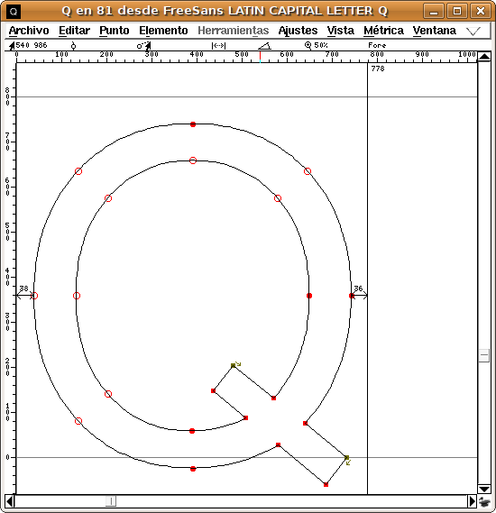
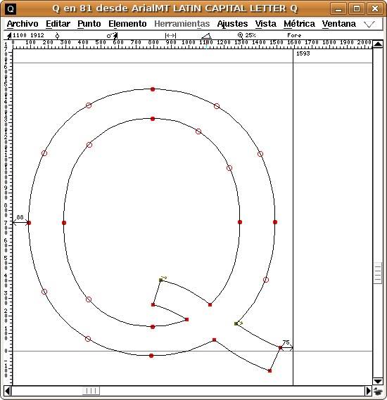
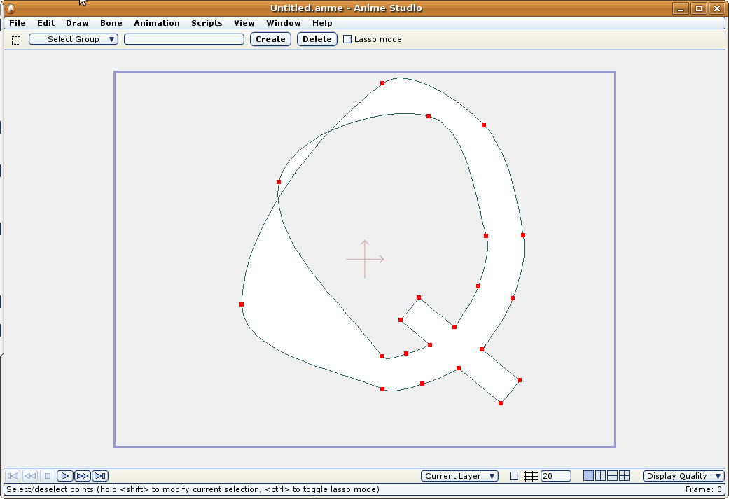
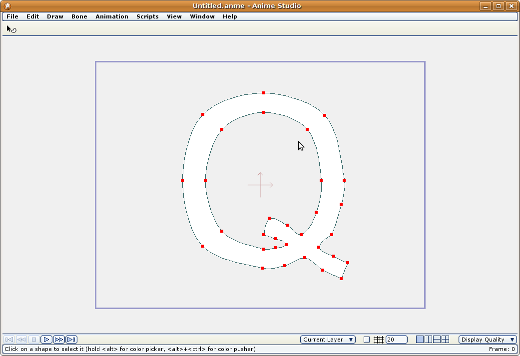
I used FreeSans to generate that 'Q'
See the font definition when open it in fontforge:
and now the same letter but in Arial:
And now how the FreeSans Q in Anime Studio:
And the Arial Q in Anime Studio:
In the FontForge capture windows, the outlined red dots means a symmetrical tangent vertex. If the dot is filled it means a split tangent (angle or length)
The FreeSans font is simpler than the other one (less control points) but it renders worse.
Is FreeSans a bad formed font? I don't know. It is used as it is: a truetype font (reproducible by its glyphs at any size).
In my honest opinion the built in algorithm that render the fonts should be reworked a little.
-G
Posted: Sat Nov 08, 2008 2:48 am
by slowtiger
The culprit clearly seems to be the font. You can't expect AS to correctly converse points and curvatures if the source information is incomplete.
From my typography days I can only advise you to look for a certain font at different manufacturers since each of them is different.
Posted: Sat Nov 08, 2008 9:20 pm
by chucky
Fonts? AAAAAARRRRRGGGGHHH!

Anime is one of the only programs I have ever used that is a complete joke when it comes to fonts.
I think Mike should incorporate traditional beziers as an option into anime , sometimes the way anime does things is a bit wacky.
Posted: Sat Jan 03, 2009 5:43 am
by basshole
Hi guys. I wanted to revisit this topic.
Regarding text: I thought I had solved my problem before by choosing a new font. However, I copied that text to another character, and manipulated it to match the appropriate perspective, and when I rendered, BAM! Super corruption on every B, and most letters that a "hole" in them (capital R, D, etc.) I didn't realize manipulating the points (shear, perspective, scale) on shapes that were already proven "valid" could corrupt them, but I guess so? Or just letters?
Also in addition to the no-nos I was warned about near the beginning of this thread (deleting points, loops in curves, offscreen shape creation), are there other things to avoid when building a shape? I just spent a ridiculously long time fixing an eye that had glitches. Don't know what I did to deserve them. Is there a certain way of connecting points that AS doesn't like, that makes a shape go bad when it's created? What about scaling, using the split curves script, anything?
Posted: Sat Jan 03, 2009 5:55 am
by Farbklecks
I mentioned something similar
viewtopic.php?t=9299
August 2007
Posted: Sat Jan 03, 2009 5:59 am
by basshole
I'll take a look. Also, what about "restyling" a shape? That is, selecting, it and changing it's color, etc.?