This test is more for the purpose of creating characters than for making animation in AS - I find myself enjoying designing characters more than animating them for the most part. But AS sure makes it easier to create AND animate them for sure!
For some reason Youtube couldn't figure out the thumbnail image properly?!?
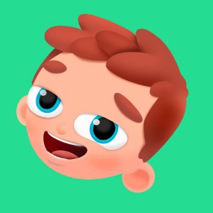
I created this to test the following:
- subtle colour layer shading
- object colour shading (on the eyes)
- drop shadows (under the eyes)
- using smart bones for all facial expressons and hair
- blinking using scaling of the iris rather than masking (looks kind of cool when the iris moves from right to left and back again - has a motion blur effect)
- single line for eyebrows with variable line width
- repetition of the same eyebrow line to create hair, bags under eyes, ear details, mouth accents
- editing circles to create all elements of the characters face (main head shape, ears, mouth, nose, eyes, white highlights on irises - neck was an edited rectangle)
- gradient in mouth when open to mimic depth
- using only one vector layer and one bone layer (downside appears to be that I can't use bone dynamics in conjunction with smart bones - even on non-smart bonesthat are in the same layer as the smart bones)
- line variation (love using variable line widths in AS - makes my characters look cool)
Some stills:

NOTES: I have a lot of luck taking circles and reshaping them to create character features in AS. The shading I used for this character seems pretty stable over the little movement I added to it.
I may take it further later. I used pretty high blur setting to get a more subtle effect and used a fairly high transparency setting, in addition to a more reddish colouring (not grey or black). the direction of the shading was level, left to right.
The eyes were similar in setting except they were shaded on 45 degree angles, or close to that. Drop shadows under the eyes were added for character but had the added bonus of accentuating them, which I like.
I just needed to know I could get decent shading effects in AS, although I found the feature somewhat anemic with regards to the number of options available (used to Photoshop's more fully fleshed out methods, I suppose). Regardless, a little thought moved things in a positive direction, and the results seem decent.
The following is a much less worked over character with different variation on the shading:

I did it in reverse - changing the shading colour to white and applying it in the reverse direction than normal.
Making the colours on the turtle darker facilitated the effect, but it also has a more obvious effect on the line work of the character.
It appears the light is coming from behind the character, rather than in front, but also dilutes the colour intensity a little which may not be desirable.
Feel free to add any thoughts or further tips!