These backgrounds look really great. You got a good feel for color, mood, composition and texture. I've looked at your other backgrounds on DeviantArt as well and they are great. You show that you're capable of using different styles and even use more abstract backgrounds. I think you really got something good going here.
But there's something wrong with every single one of them : perspective.
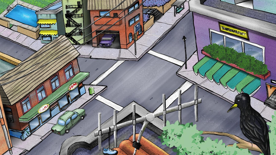
You give each object in your backgrounds their own set of vanishing points.
Take this one for example :
http://parkerx87.deviantart.com/gallery/#/d2g3icb
There are 3 paths leading to the 3 doors. These paths are, of course, running parallel to each other.
Lines that are parallel in the real world should have the same vanishing point in the picture when drawn in perspective.
But you have given each path its own vanishing point. If you would make the lawn bigger then the lines would even cross! Which is impossible because in the real world they run parallel to each other. They would never cross.
This is how they should run (I've chosen the vanishing point of the path in the middle) :

Note how the lines all go through that same vanishing point in the middle. I've chosen this background because it's shows most clearly where you go wrong with perspective. But it goes for all of your backgrounds that use perspective. In some backgrounds it doesn't matter that much, in some it is hardly noticeable and in others it is blatanly obvious.
Your backgrounds look very beautifull, they deserve proper perspective.
There are tons of webpages out there that teach perspective. The "
parallel lines in the real world have the same vanishing point in the picture" is just one of several rules for perspective. There are several types of perspective (1, 2, 3 point, spherical, etc.). And it takes a bit of practice to use these rules properly (drawing circles in perspective, drawing a winding road over hills, etc) and to know when to bend the rules a little bit (the infamous "telegraph pole in the middle" is a good example of when the rules should be bend).
It's imperative to have proper perspective in backgrounds. A picture with flimsy perspective might still look beautifull but as soon as any animation takes place in it then the animator will be in deep troubles because a character walking through a background with faulty perspective will seem to float half the time.